Posts
HistropediaJS 1.6.0 – millisecond timelines, clearer dates, and custom layouts
Previous release: HistropediaJS v1.5.0
HistropediaJS has long been able to handle dates across billions of years. Version 1.6.0, released on 4 September 2026, adds detail in the other direction: timelines can now zoom through hours, minutes and seconds, all the way to individual milliseconds. You can explore a launch sequence or a split-second event using the same articles, charts and navigation as any other timeline.
New sticky date labels help you keep track of where you are as you pan, and an optional extra row shows the surrounding date. You can also change more of the timeline’s appearance, including the main line, article date markers and chart colours.
Custom card layouts, available since v1.3.0, are easier to style and now have a complete web guide. Here are the main changes, with examples to try and a few things to check when upgrading.
Build timelines down to the millisecond
You can now add hour, minute, second, and millisecond fields to article dates, time bands and chart data, and use them when moving around the timeline. Existing date-only data works as before.
Your timelines keep their existing zoom limit unless you change it. The default zoom.minimum: 0 stops at days; the example below lowers it to allow millisecond zoom.
The examples below use the npm/ES module build. Start with an empty <div id="timeline"></div> on your page, then run this JavaScript through your project’s build tool. For a script-tag setup, use Histropedia.Timeline and Histropedia.Dmy instead of the imports; see Installation.
import { Timeline, Dmy } from 'histropediajs';

const container = document.getElementById('timeline');
const launch = {
  id: 'launch',
  title: 'Launch sequence starts',
  from: {
    year: 2026,
    month: 8,
    day: 13,
    hour: 12,
    minute: 30,
    second: 15,
    millisecond: 5,
    precision: 'millisecond',
  },
};

const timeline = new Timeline(container, {
  height: 360,
  initialDate: '2026-08-13T12:30:15.005',
  zoom: {
    initial: -80, // Open at millisecond scale.
    minimum: -82, // Allow users to zoom a little closer.
  },
});

timeline.load([launch]);
The timeline opens with the launch time at its left edge. The next examples reuse this timeline.
Use precision to say how much time an event covers. For example, 'millisecond' covers a single millisecond, while 'minute' covers the whole minute. Set this explicitly for sub-day articles and time bands in v1.6.0; the date precision guide explains the other choices.
Tick spacing adjusts as you zoom, and clock-style labels make precise times easier to read.
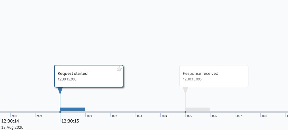
Explore this millisecond timeline on CodePen, or try the Sub-day Zoom example to jump to an exact millisecond or fit a one-millisecond range at the year 1,000,000,000.
Navigate with date-time strings
You can now move around a timeline using date-time strings. They work with initialDate, date bounds and navigation methods such as setCentreDate() and fitDateRange(). Existing date objects and Dmy values still work too.
Start with a date such as '2026-08-13', then add a time after T or a space. BCE and billion-year dates work too. You can include up to three decimal places for seconds: .25 means 250 milliseconds.
// Centre the launch event without changing the zoom.
timeline.setCentreDate('2026-08-13T12:30:15.005');

// Or fit the ten-millisecond window around the launch.
timeline.fitDateRange(
  '2026-08-13T12:30:15.000',
  '2026-08-13T12:30:15.010',
  { padding: { left: 80, right: 80 } }
);
These strings have no timezone, so leave out suffixes such as Z or +01:00. If you use just years or months with fitDateRange(), it fits the whole year or month. See Dates and Dmy for more examples and guidance on BCE dates.
Calculate and format times with Dmy
The built-in Dmy date/time helper lets you add time to a date and format the result. Here, we use the launch time to calculate when the next frame would occur, 16 milliseconds later:
const launchTime = new Dmy(launch.from);
const nextFrame = launchTime.addMilliseconds(16);

launchTime.format('D MMM YYYY HH:mm:ss.SSS');
// '13 Aug 2026 12:30:15.005' — the original is unchanged.

nextFrame.format('HH:mm:ss.SSS');
// '12:30:15.021'

nextFrame.precision;
// 'millisecond'
You can also add days, hours, minutes or seconds. These methods handle changes of day, month and year, and return a new date without changing the original.
Dates now keep their precision setting when you create or adjust them with Dmy. getDayOfYear() also gives the correct result after you change a date.
Keep the surrounding date visible
Date labels can now stick to the left edge as you pan. For example, the current month stays visible until the next month’s label pushes it out, so you can keep your bearings as you move along the timeline.
The default 'auto' setting makes major labels stick at month and closer scales. Use true for every scale or false to turn it off.
When you’re looking at seconds or milliseconds, a time on its own may not tell you enough. The optional parent row shows the date underneath the time labels. This example turns it on for all sub-day scales:
timeline.setOption('style.dateLabel', {
  major: {
    sticky: { enabled: 'auto', offsetX: 4 },
  },
  parent: {
    visible: true,
    levels: ['millisecond', 'second', 'minute', 'hour'],
    sticky: { enabled: true, offsetX: 4 },
  },
});

// Refit the cards after reserving space for the new row.
timeline.fitToHeight();
The parent row is off by default. You can choose when it appears and change its height, font and colours. It works with BCE and deep-time dates too; see the Parent Date Labels guide.
Style the main line and article date indicators
The main timeline line can now use a solid colour or a top-to-bottom gradient, set with style.mainLine.color. The default colours have been refreshed too, with a solid main line and updated card and marker colours.
The small date markers on the line can be rectangles or circles, with their own size, colour and opacity. Set the colour to 'article' to match the card, including when it’s selected:
timeline.setOption('style.mainLine', {
  color: {
    type: 'gradient',
    topColor: '#1d4ed8',
    bottomColor: '#60a5fa',
  },
  dateIndicators: {
    visible: true,
    shape: 'circle',
    size: 6,
    color: 'article',
    hiddenStyle: { opacity: 0.25 },
    activeStyle: { color: 'article', size: 9, opacity: 1 },
  },
});
In this example, selecting an article makes its marker larger. Articles hidden by density filtering still have a faint marker, so readers can see that there is more to explore. The Timeline Style reference covers all the options.
Upgrading? If you used style.mainLine.showDateIndicators, replace it with style.mainLine.dateIndicators.visible.
Choose chart palettes and grid lines
Use chart.seriesColors to choose the colours for your charts. Series keep their assigned colours as you add or remove data. Any colours you’ve set on individual series, or with style.series.color, still take priority.
You can change the palette on a timeline that already has charts:
timeline.setOption('chart.seriesColors', [
  '#2563eb', // Blue
  '#dc2626', // Red
  '#16a34a', // Green
  '#9333ea', // Purple
]);
The chart colours update immediately, keeping any colours you’ve set individually. You can also supply the palette when creating a timeline.
To set grid lines for all charts, use chart.defaultStyle.gridLine:
timeline.setOption('chart.defaultStyle.gridLine', {
  x: {
    major: { visible: true, thickness: 1 },
    minor: { visible: true, thickness: 1, minimumSpacing: 20 },
  },
  y: {
    major: { visible: true, thickness: 1 },
  },
});
Each chart can still have its own style.gridLine settings. The old chart.gridLine option still works but now gives a warning; use chart.defaultStyle.gridLine instead.
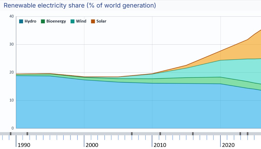
See the Charts reference and live Charts example for chart data and styling in context.
Create custom cards with predictable styles
If the built-in cards don’t suit your design, you can draw your own. Custom layouts have been available since v1.3.0; this release makes them easier to style and adds a complete Custom Card Layouts guide.
The new getCurrentStyle() method gives you the style a card should use right now, including any changes for hovering or selection. Your drawing code can use it without having to work out which style applies.
This separate example draws a simple text card. Run it in place of the opening example, registering the layout before creating the timeline:
import { Timeline } from 'histropediajs';

Timeline.registerCardLayout({
  name: 'compact',

  draw(ctx) {
    const style = this.getCurrentStyle();
    const { left, top } = this.position;
    const width = this.getWidth();
    const height = this.getHeight();

    ctx.save();
    ctx.fillStyle = style.backgroundColor;
    ctx.fillRect(left, top, width, height);

    ctx.fillStyle = style.header.text.color;
    ctx.font = style.header.text.font;
    ctx.textAlign = 'left';
    ctx.textBaseline = 'middle';
    ctx.fillText(this.title, left + 10, top + height / 2, width - 20);
    ctx.restore();
  },

  defaultStyle: {
    width: 220,
    height: 48,
    backgroundColor: '#eff6ff',
    header: {
      text: { color: '#0f172a', font: '600 14px sans-serif' },
    },
  },
  defaultHoverStyle: { backgroundColor: '#dbeafe' },
  defaultActiveStyle: { backgroundColor: '#bfdbfe' },
});

const timeline = new Timeline(document.getElementById('timeline'), {
  height: 360,
  initialDate: '2026-08-13',
  article: {
    defaultCardLayout: 'compact',
    // Keep the custom layout at every available height.
    cardLayoutBreakpoints: [],
  },
});

timeline.load([
  {
    id: 'launch',
    title: 'Launch day',
    from: { year: 2026, month: 8, day: 13 },
  },
]);
draw() controls how the card looks, while its width and height come from the layout’s style. The ctx.save() and ctx.restore() calls keep the card’s drawing settings from affecting the rest of the timeline.
Styles set on a timeline, lane or individual article now override layout defaults. Check any custom layouts that relied on the old order.
Try the Article Styling example to switch between built-in cards and compact (custom). The guide goes further, with cards that resize to fit their content, star icons and TypeScript examples.
More reliable rendering
Several smaller fixes support the new scales and custom layouts:
- Charts keep drawing correctly, even when some data points are far off screen.
- Connectors line up with their cards more consistently at different screen resolutions.
- Star buttons are easier to target, with hover and click areas that line up more reliably with the icons.
The new options are also covered by the TypeScript definitions.
Before you upgrade
When updating an existing timeline, check these points:
- Lower
zoom.minimumonly when you want sub-day zoom, and set sub-day data precision explicitly in v1.6.0. - Use dates and times in the timezone you want to display; Histropedia date strings don’t convert between timezones.
- Replace
style.mainLine.showDateIndicatorswithstyle.mainLine.dateIndicators.visible. - Move timeline-wide chart grid-line settings to
chart.defaultStyle.gridLine. - Check the new default colours and any custom cards where you’ve overridden the layout’s styles.
Open the Sub-day Zoom example for a quick tour, or visit Downloads and release notes to get the library and read the complete changelog.